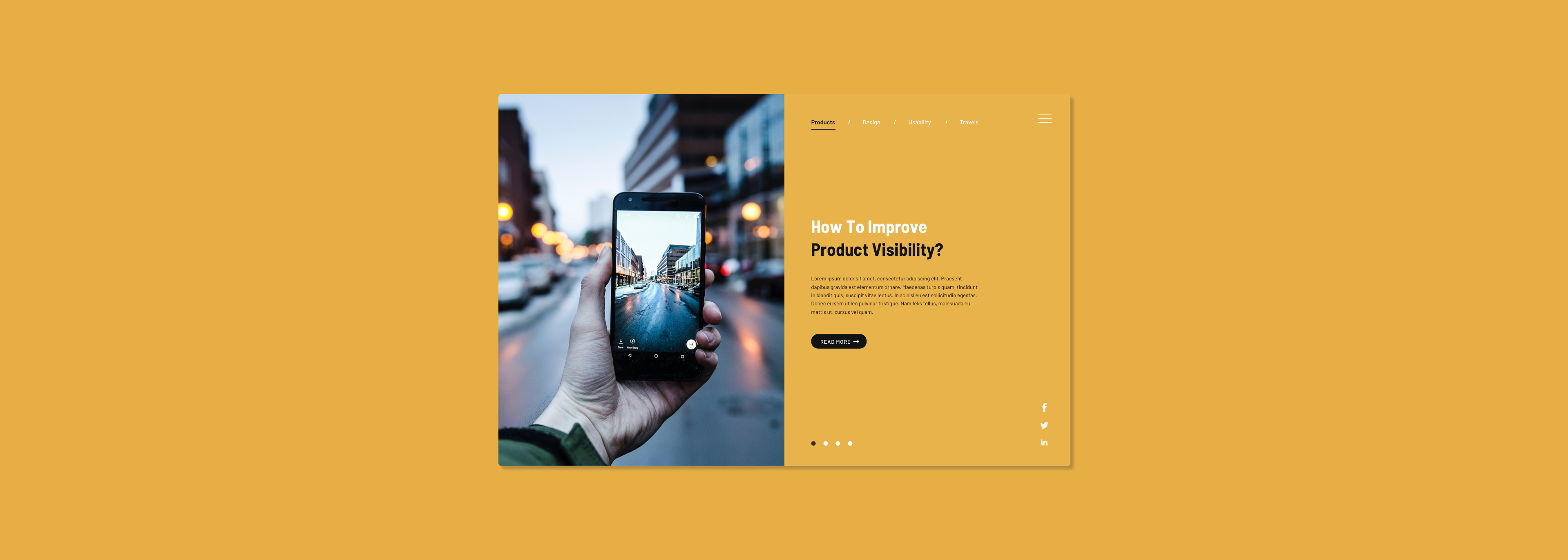
As a designer, I read articles everyday to improve my knowledge and get insights into current design trends. This includes case studies, news and personal blog posts from designers. Many people read blogs as a way of entertainment and a method to learn through reading the life and experiences of others. However, have you realised that most of article pages we've come across stick with the contemporary grid format? With that said, it'll most likely include a small image and a snippet of the post as well as a read more button that either are aligned in a multiple column grid or in one singular page with endless scrolling. Maybe we are so use to it that we think it's the only way that will making our reading experience comfortable. Therefore I'm trying to tackle this traditional layout and reshape our thinking on how a blog/article could look and feel.
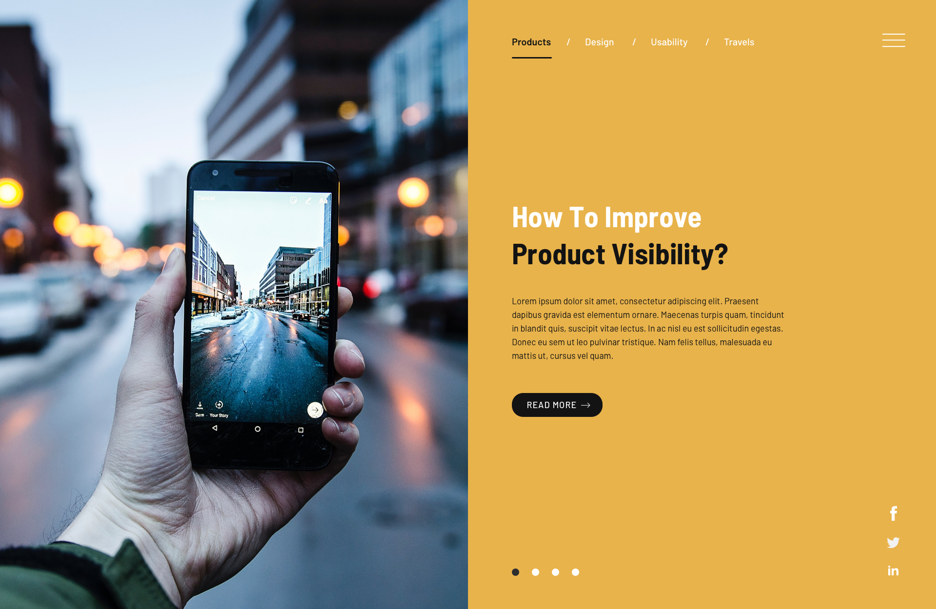
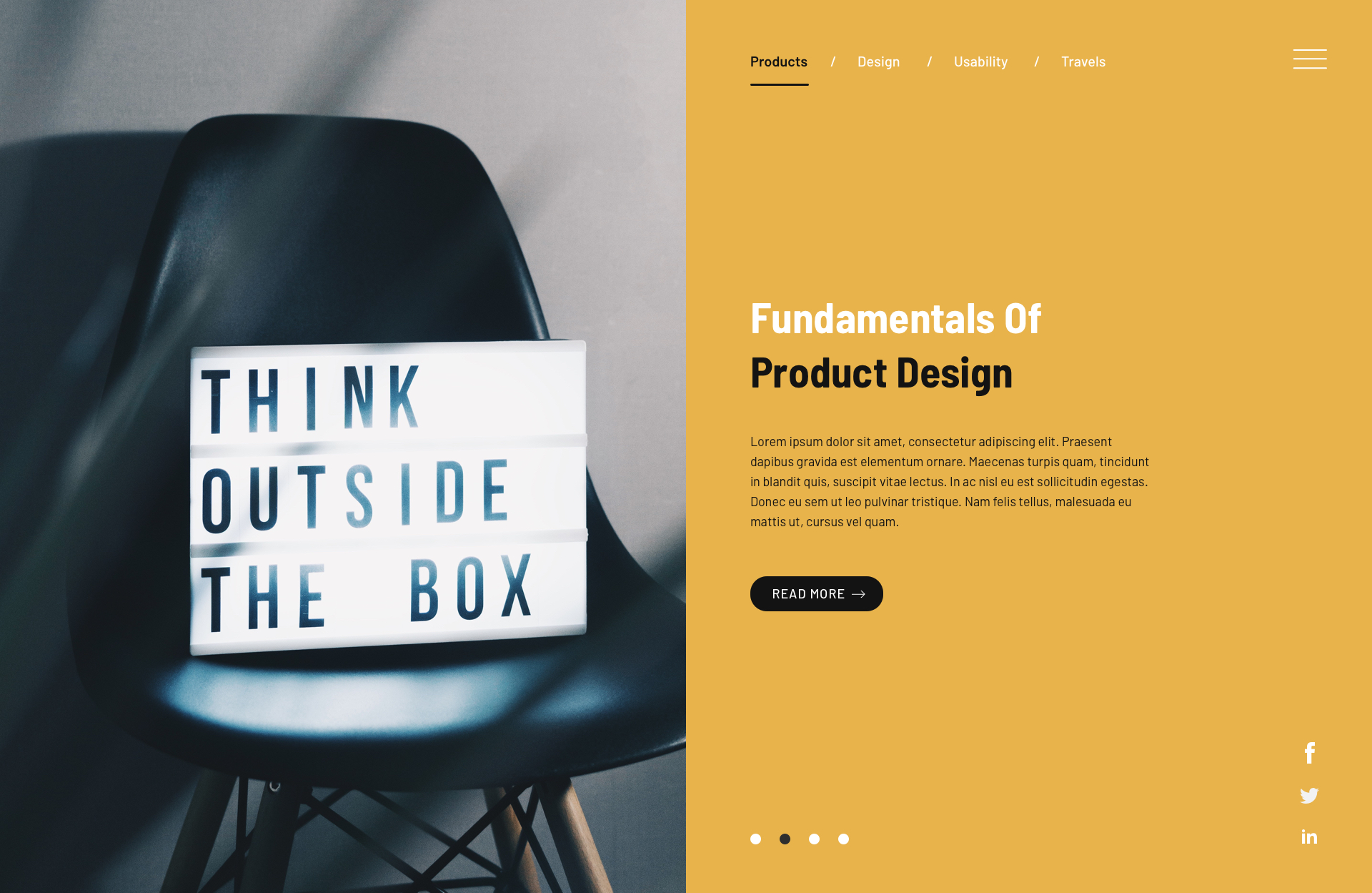
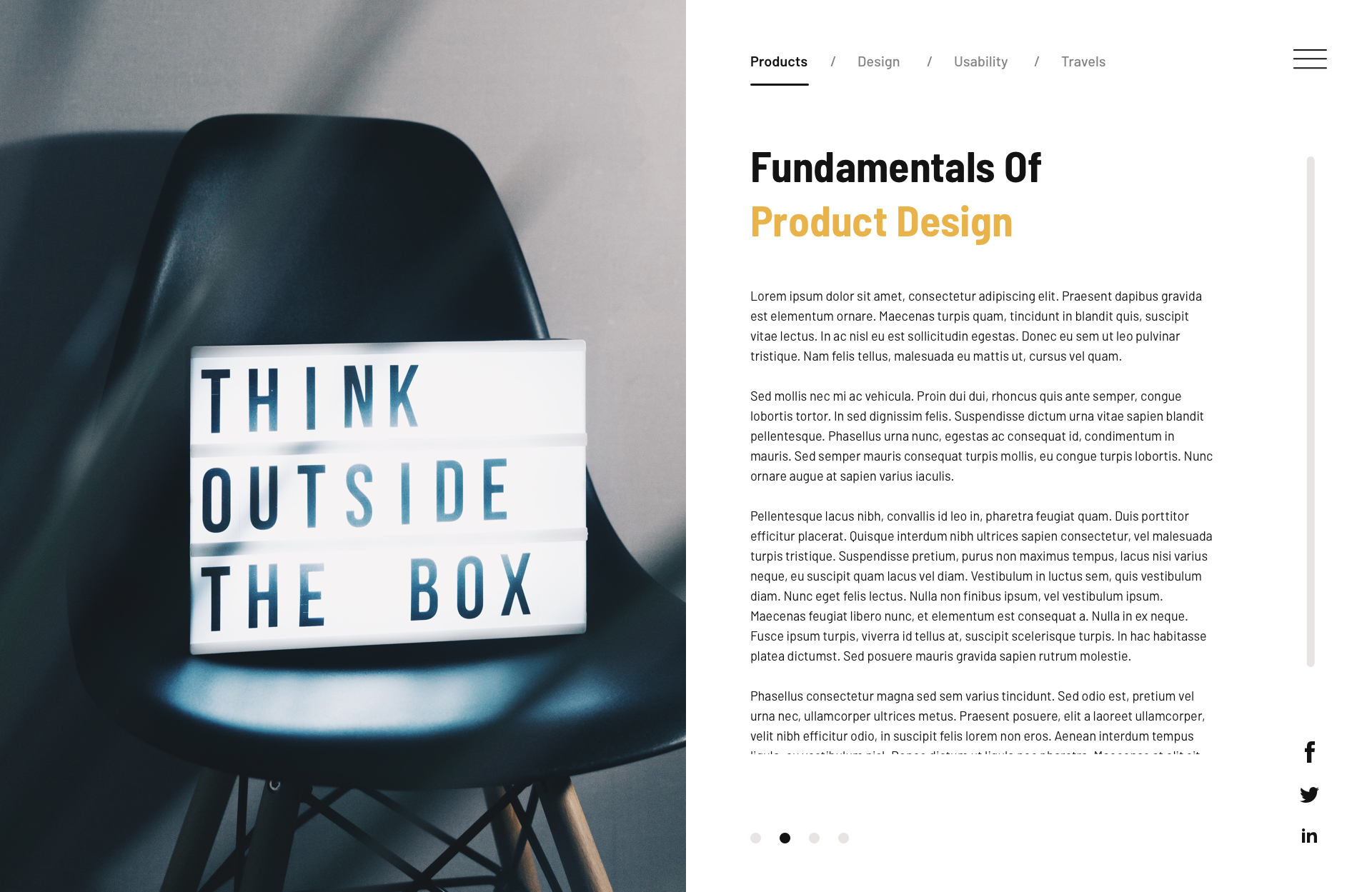
As readers and designers, we're use to the standard grid and vertical scrolling format in the article/blog page of an website. This is because it's a
traditional format that allow users to see the type of posts the blog have and select the post/s that they are interested in. However, most of us select the blog
post based on the category. E.g. if I was looking for 'design' posts then I would be in the 'design' category or simply searching up for design related blog
posts. We don't usually end up on the blog page of a website scanning through the posts one by one.
Therefore the design and experience proposed is intended to only display a category or section to a blog. For example, blog articles are grouped based on
the category of 'products' and when the user select the 'products' blog category, it'll bring the user to the given design which show the posts under category
'products'. User will be allowed to choose another category from the menu above.
Also, in most cases, blog page/s are only a section to a sitemap of a website. Therefore it's important to include navigation that allows the user to access
other parts of the website. That is the hamburger icon of the top right.
In terms of interface, we usually become attracted to images first than the content. The image is what catches our attention and the content is what
keeps our focus. By incorporating a full screen reading format with pages transitioning only left and right, users will not be disturbed by long page scrolling.
The design involves separating the image to the left and content to the right. With the showcase image taking up the full width of the column, the user will navigate
through a selection of articles from a category based on their interests. The experience of flipping and selecting will be involved through the selectors on the bottom of
the screen. By putting the articles in a format similar to a gallery, the user will be 'viewing' the selection instead of 'reading' the selection.
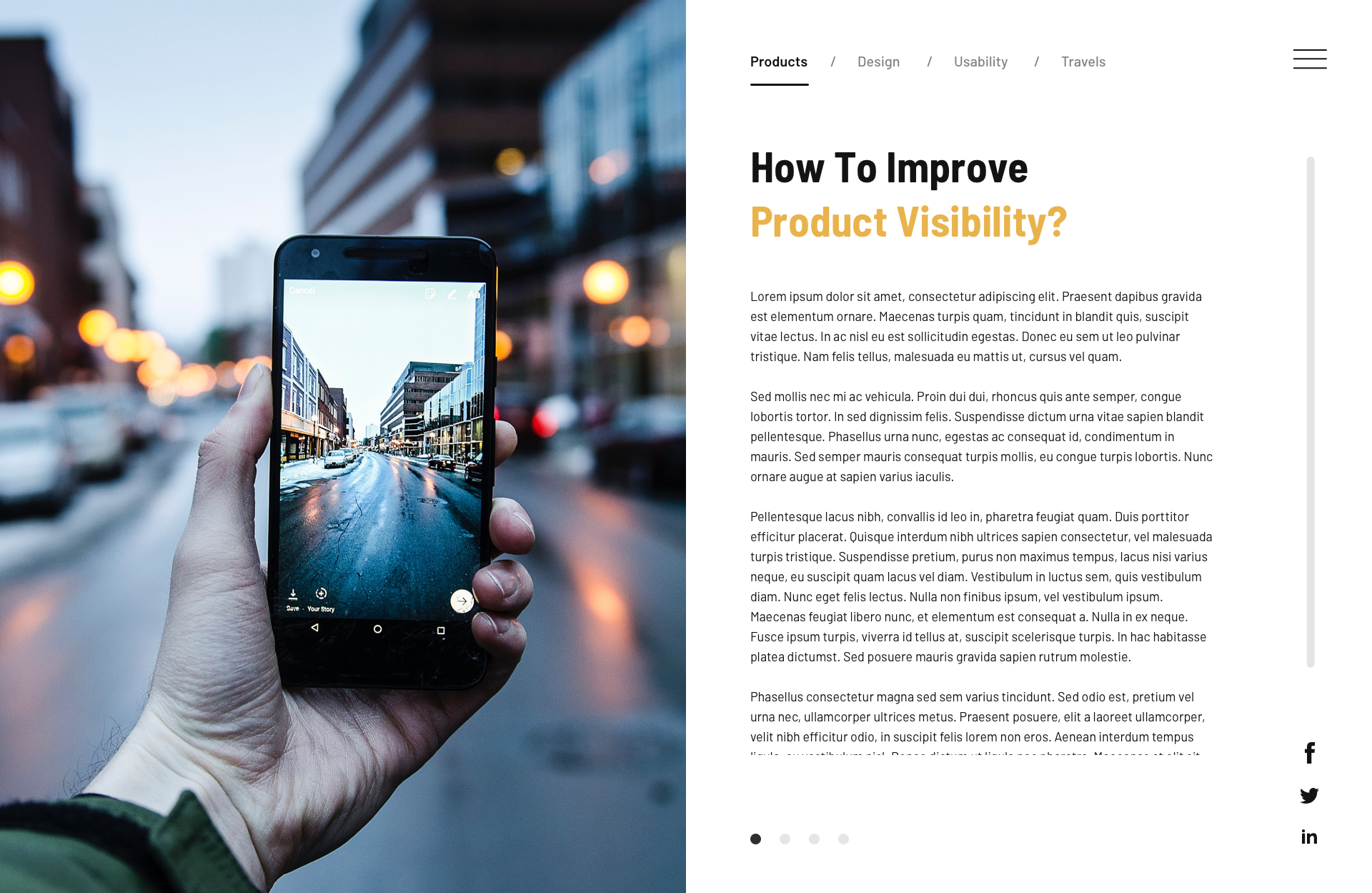
Adding a transition when the read more button is clicked, the interface on the right is replaced with the full article. This 2 page spread
format with full content of post gives the user an experience of reading a printed magazine but in a digital platform. Adding a scroll but within the
contained height of the screen, this effect will remind the user that they are actually reading off a digital interface. Unlike traditional post page,
where the content is separated by multiple images throughout as a break, showcasing the featured image on the left will give the user a break anytime they feel the
need to. Social media share buttons are also included and easily accessible as it's clearly lined on the right.
What to know more about me and what I do? Want to collaborate and create awesome work? Feel free to get in touch anytime!
Let's Chat