Current Design
Inspiration
Wireframes
Aesthetics

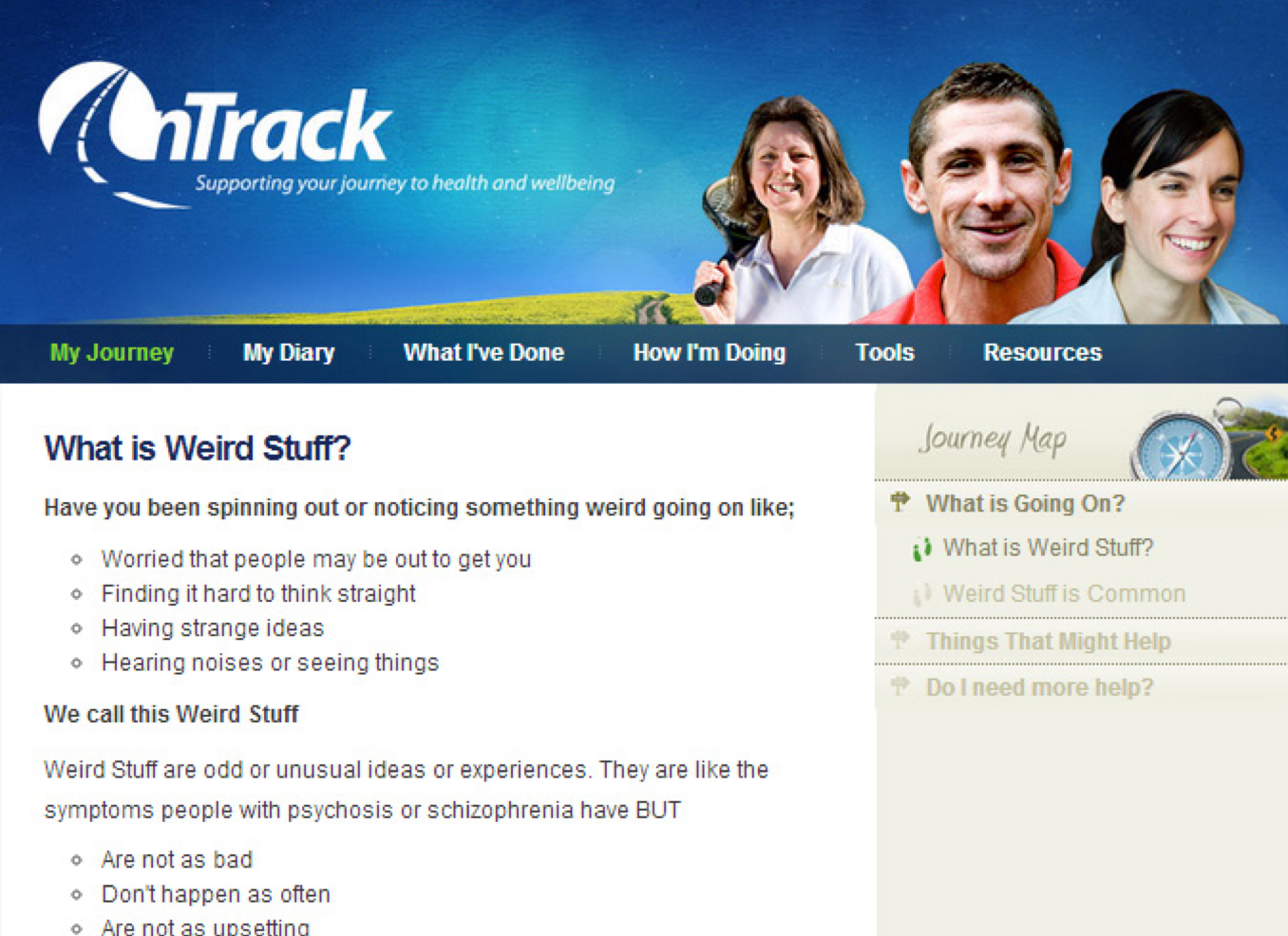
Get Real is one of the free online treatment program available through On Track. On Track was developed by a research group of Queensland University of Technology psychologists with sponsorship from the Queensland Government. Get Real is primarily designed for young people between the ages of 16 to 24 who are experiencing negative side effects from substance abuse, namely cannabis. Making its services accessible online means that more people with mental and physical health concerns are able to get assistance. The program provides the users with the information and skills that will enable them to manage their issues, keeping them on track. They also provide the users with a variety of quizzes and additional help from professionals.


In order to make the complex concepts associated with self-care and mental health more acceptable and accessible to young people, the program was structurally designed to be delivered in thematically based modules. Each module is focused on a different experience that guides the users through informative and explanatory material. Even though the contents are reduced and broken down into different sections but there are still too many information through the journey which later becomes too overwhelming. This overload of information will cause the users to lose patience and concentration, especially considering those facing mental issues. Therefore it is important to propose a new and original concept for the Get Real program that aims to make main ideas and tools in the program more relevant, engaging and meaningful to the young users.
There are just too many drug and mental illness related websites currently available. These include private owned websites
as well as government owned. These websites work just like Get Real where they provide the users with information, quizzes,
real-life cases, videos and help. However, most of them are usually boring, dull and they empower its audiences with an overload of
information. Thus, websites associated with mental illness often makes the users feel unwelcoming and even more depressed.
For this reason, when designing the new Get Real concept, it's important to consider the following elements: functionality,
aesthetics, communication and interactivity. Warmer colours will also be used to promote a more positive and memorable experience.
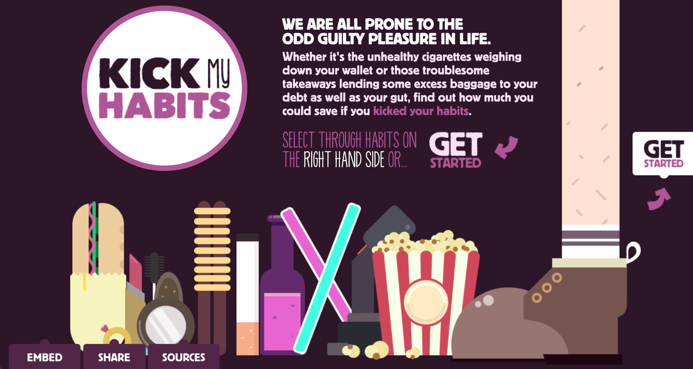
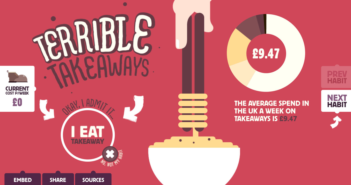
My concept was greatly inspired by the Kick-My-Habits website. Kick-My-Habits is an interactive website designed to help everyone
quit bad habits. The site is bursting with colourful illustrations and charming infographics to create a fascinating experience.
This design was truly inspiring and brings a dry subject to a vibrant life. Keeping with the original on track theme for Get Real,
I was inspired from Kick-My-Habits to create a website that keeps tracks of how the user is feeling and how they are going.
The concept for the new Get Real website is an interactive self-assessment journey that focuses on keeping track of how the user
is feeling and recordings of how they are going. To achieve this, users are asked simple but effective questions that are recorded as
percentages representing the emotions and how the user is currently feeling. After a series of interactive self-assessing quizzes, they can watch videos and get advices from professionals.
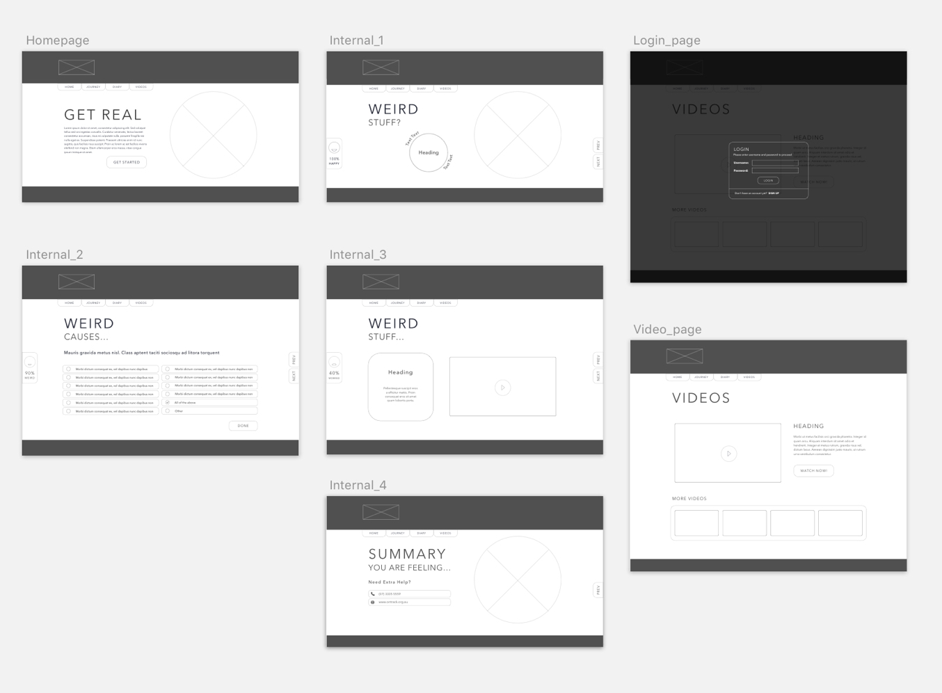
A lo-fi paper prototype was first conducted in order to test the user journey, and refine the functions and design before creating the wireframes template. After the lo-fi prototype,
the navigation bar was moved to the top to increase attention and readability for the users. Instead of having multiple interactive features on a page (which normally becomes overly distracting
and loses usability), the new strategy was to create a focal interaction. This helps users to focus and maintain their engagement with the program. This strategy is evident on every page with
the hover effect as the main interaction.
Then a series of wireframe mockups were created to used as a guide and template for the final design. This involved the adjustments and arrangements content, artwork, overall layout,
placement of buttons and the navigation bar.
Make sure that the content is in the right page and follow the structure given. This will ensure that the program remains in an interactive and thematically based module. This module will interact
with the users and help guide them through the program easily while providing them with useful information.
Every link should be clearly labelled with titles that are easy to understand. They should not mislead the user. The font size, font style and the colour of the titles should accompany the
background colour so that they are easily distinguishable. Also, to increase accessibility of the tools, text should be bolded to highlight the most relevant information and images will be prioritised.
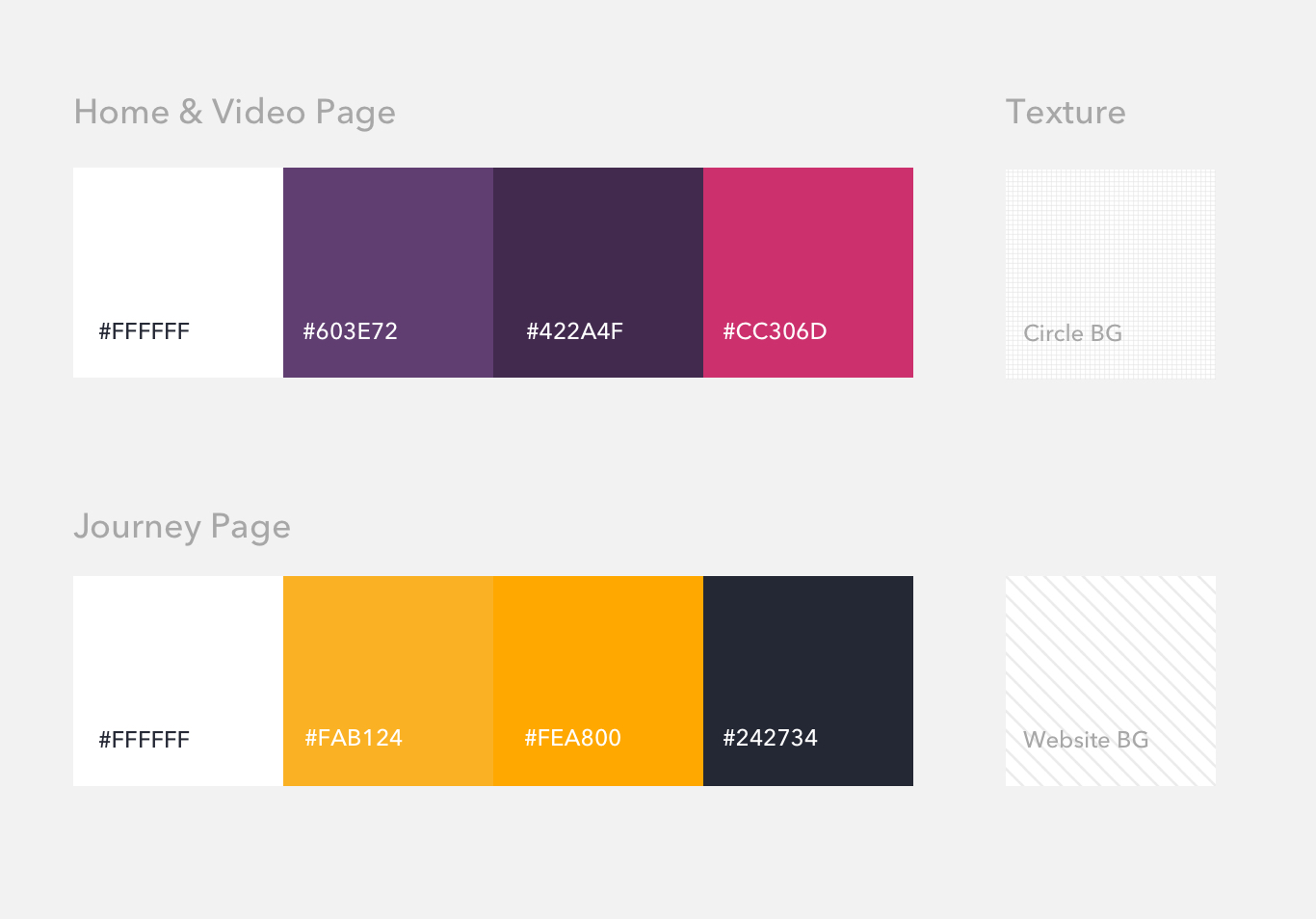
A slightly warmer and energetic mood is portrayed throughout the website. Instead of using sharp and vibrant colours which can be frightening and disctracting, I've decided to use a creamy yellow
to represent a more optimistic mood throughout the journey pages. Elements are highlighted with a different shade of the yellow. For the homepage and video pages, a creamy purple is used and again
with elements highlighted with a different shade of the purple. Buttons use a bright but smooth pink to add a pop to the overall design. The heavier dark blue is used throught the design accross
the navigation, footer as well as the text to bring the overall content and artwork forward. Texture is also used to add dimension to the overall flat design.
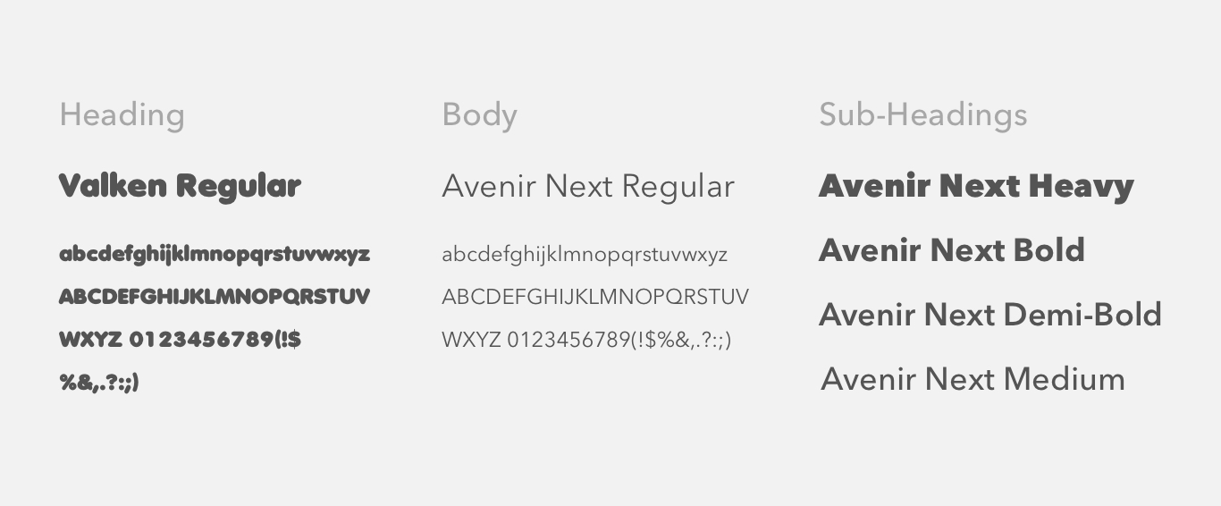
In terms of typography, rounder edged typography styles are used to accompany the circles and create a more caring and comfortable appeal. The website uses two main fonts which are Valken and
Avenir Next. For headings and content that require emphasis, type will be capitalised to create a stronger impression. Most of heading fonts will involve character spacing, to reduce crowding
caused by the boldness. Body text size will vary between 18px to 20px as these are the optimal font size for reading accross desktop. The heading and sub heading font sizes vary depending on
context and layout of each page - such as positioning text in the circles to make them fit nicely and varying font weights to highlight certain keywords.
What to know more about me and what I do? Want to collaborate and create awesome work? Feel free to get in touch anytime!
Let's Chat